- Style guide
- Style circles
- Core visual identity
- Middle circle
- Colours of faculties and topics
- Colours of the Faculty of Arts and Humanities
- Colours of the Faculty of Social Sciences
- Colours of the Faculty of Medicine
- Colours of the Faculty of Science and Technology
- Colours of the entrepreneurship topic
- Colours of the culture topic
- Colours of the student life topic
- Outer style circle
- Logos
- Design principles
- Colours
- Design examples
- Special cases
- Materials for download
Middle circle
Middle circle
The design principles and elements of the middle circle are followed by units that are strongly associated with the university’s identity, values and academic and research work. They have the possibility for minimal visual distinction according to the faculty or topic.
The faculties of the middle circle:
- Faculty of Arts and Humanities
- Faculty of Social Sciences
- Faculty of Medicine
- Faculty of Science and Technology
The topics of the middle circle:
- Entrepreneurship
- Culture
- Student Life

The units in the middle and outer circles can also choose to use only the design principles of the inner circle.
The inner circle design is recommended if you want to spread an (official) message centred on the university, e.g. in international communications.
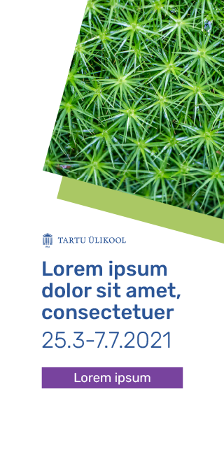
Logo Placement
There are requirements for logo placement in the middle circle.
You can use all logo variants, but the primary logo is preferred. Use of the vertical and circular logos must be reasoned.
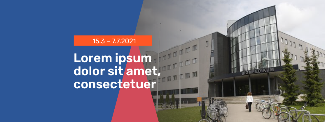
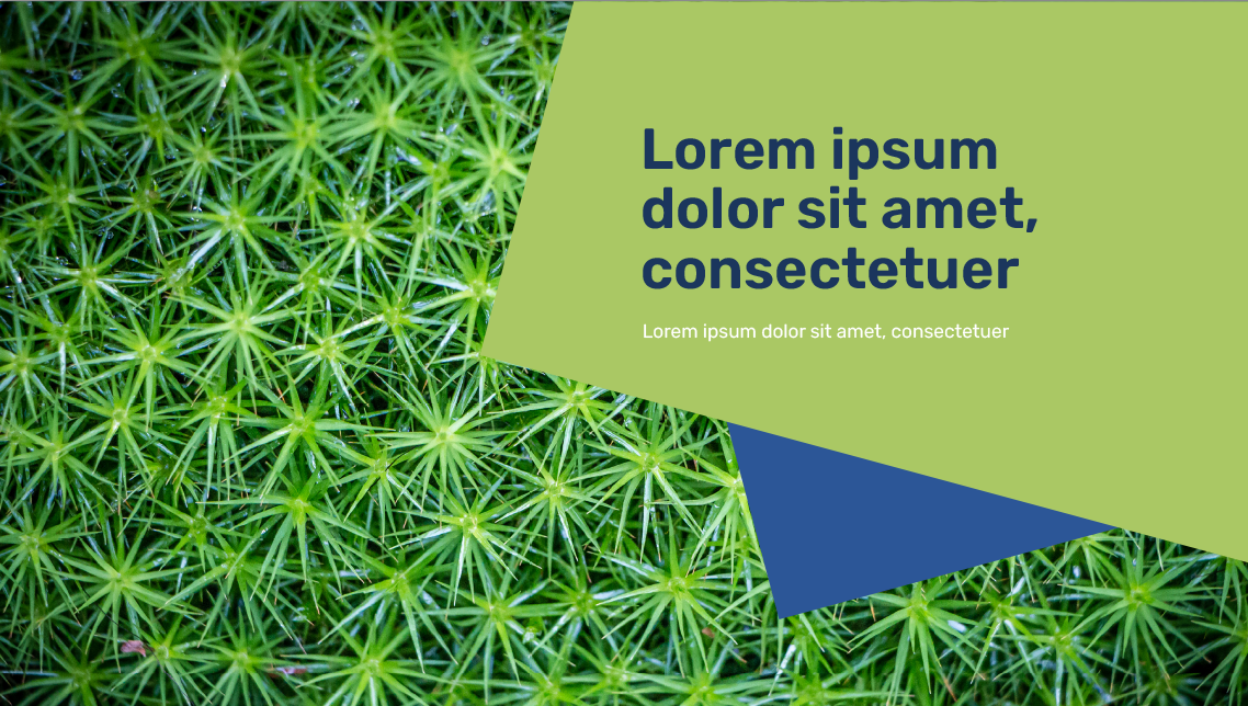
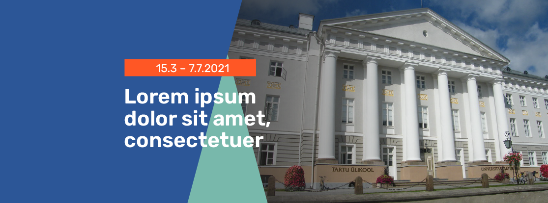
The logo can be placed in a rectangle that is at a 15 degree angle or into the negative space outside of it.
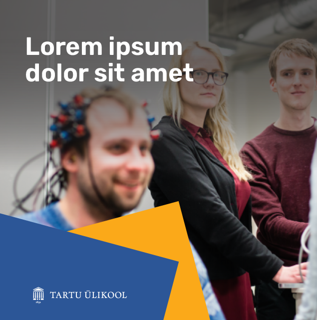
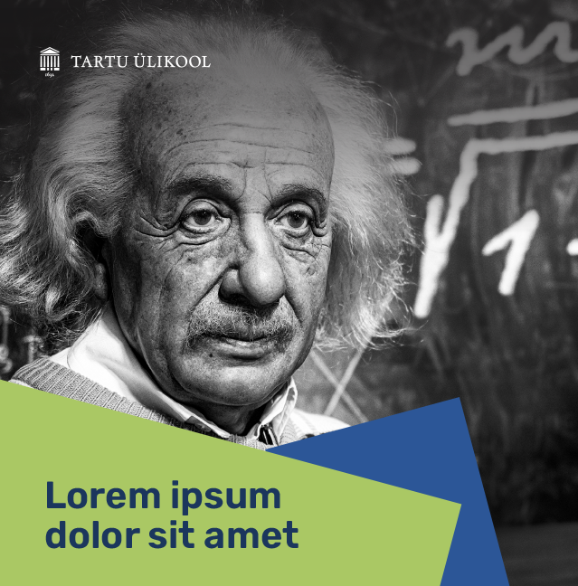
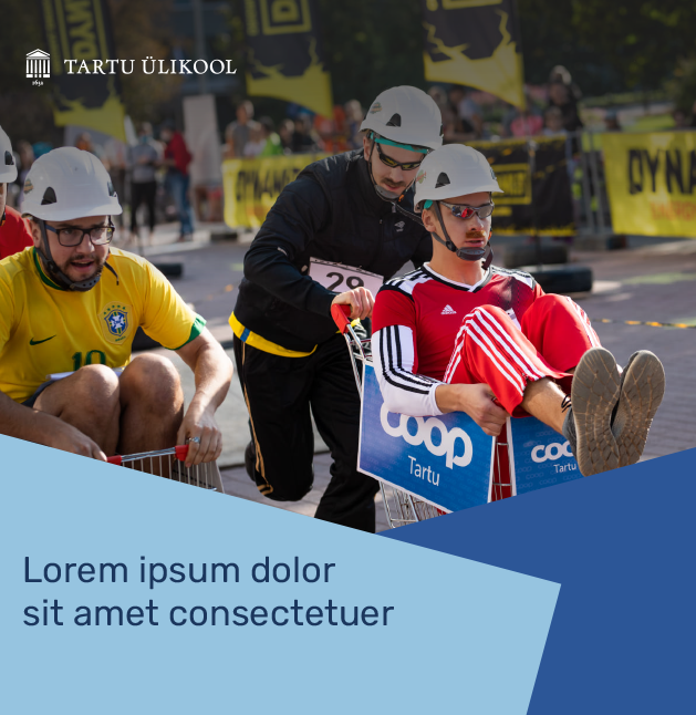
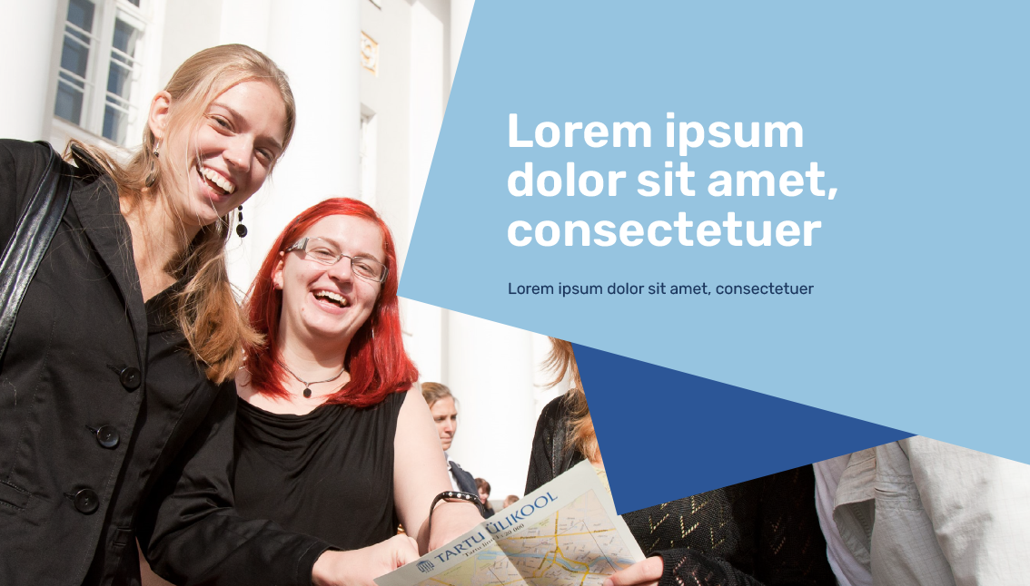
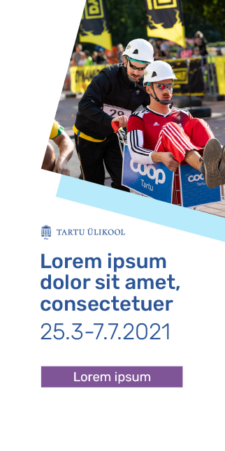
The logo can also be used on a photo if there is sufficient readability. A plain and single coloured area on a photo should be preferred. Photos can be edited.
The logo cannot be placed on the background of a faculty, topic or accent colour.
See the chapter ‘Terms of Use of the Logo’.

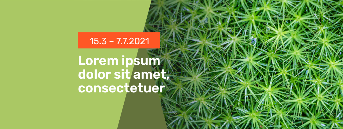
Faculty and Topic Colours
The units in the middle circle can use either the middle or inner circle colours. The middle circle palette includes the colours of the faculties and topics.
The amount and proportion of the inner circle colours is not fixed.
Using the signature blue in the design (as a surface or font colour) is mandatory.
The colours can be combined with photos, graphics or a white background.
The proportion of purple and orange accent colours must be the smallest (up to 10% of the surface).

Principles of Combining Colours
The units in the middle circle can use either the middle or inner circle colours. The middle circle includes the colours of the faculties and topics.
The amount and proportion of the inner circle colours is not fixed.
Using the signature blue in the design (as a surface or font colour) is mandatory.
The main image and faculty colours are preferred on larger surfaces and light and dark accent colours are recommended to be used in smaller amounts.
The proportion of purple and orange accent colours must be the smallest (up to 10% of the surface).

Combining the colours of the Faculty of Arts and Humanities
The signature colour of the Faculty of Arts and Humanities is purple.
You can use the blue colours of the inner circle and the colours of the faculty and topic in the middle circle.
The amount and proportion of the inner circle colours is not fixed.
Using the signature blue in the design (as a surface or font colour) is mandatory.
The colours of the inner circle and the faculties are preferred on larger surfaces and light and dark accent colours are recommended to be used in smaller amounts.
The colours can be combined with photos, graphics or a white background.
The proportion of purple and orange accent colours must be the smallest (up to 10% of the surface).


Combining the Colours of the Faculty of Social Studies
The signature colour of the Faculty of Social Studies is yellow.
You can use the blue colours of the inner circle and the colours of the faculty and topic in the middle circle.
The amount and proportion of the primary palette colours is not fixed.
Using the signature blue in the design (as a surface or font colour) is mandatory.
The colours of the inner circle and the faculties are preferred on larger surfaces and light and dark accent colours are recommended to be used in smaller amounts.
The colours can be combined with photos, graphics or a white background.
The proportion of purple and orange accent colours must be the smallest (up to 10% of the surface).

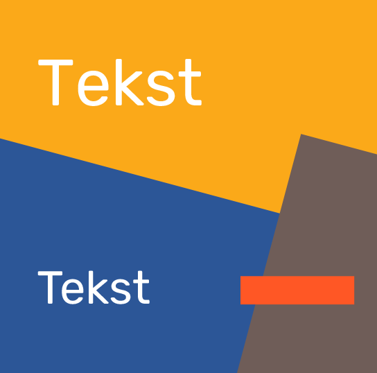

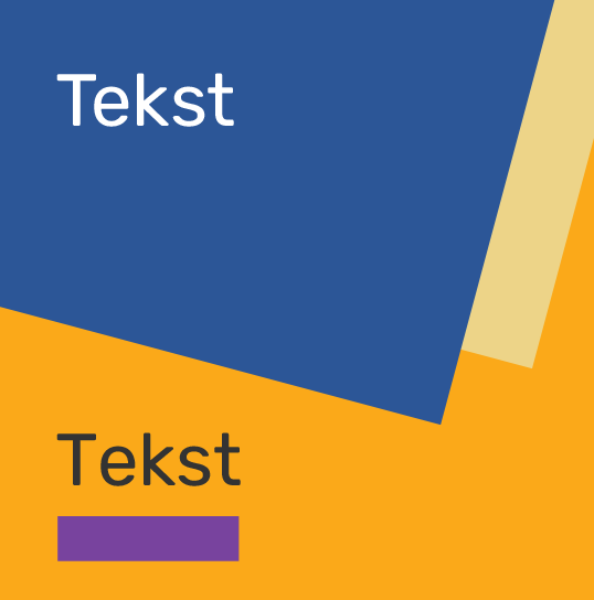

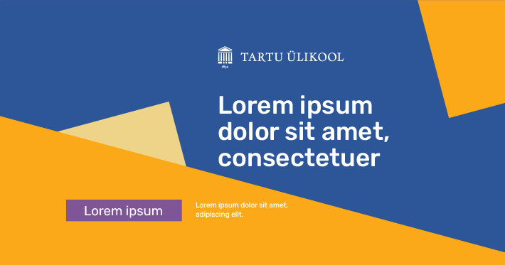
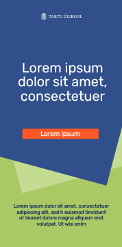
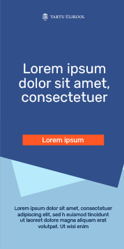
Image and link shared on Facebook 1200 × 628/630 px
Instagram image 580 × 1080 px


Leaderboard ad 728 × 90 px

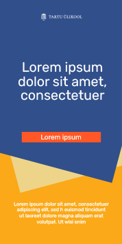
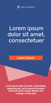
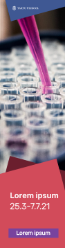
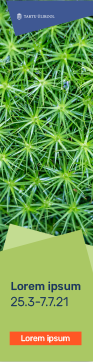
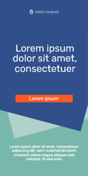
Instagram Story 1080 × 1920 px

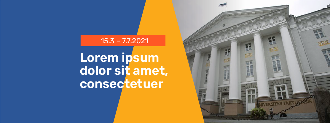
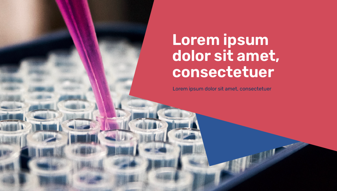
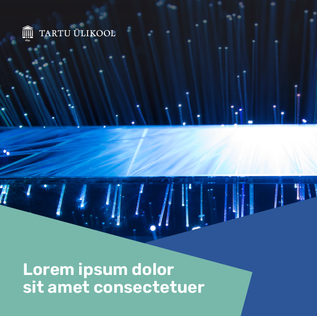
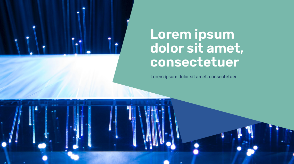
Facebook event image 1920 × 1080 px

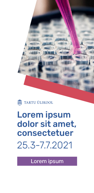
Instagram image 580 × 1080 px
Facebook cover image 1880 × 704 px (double size)
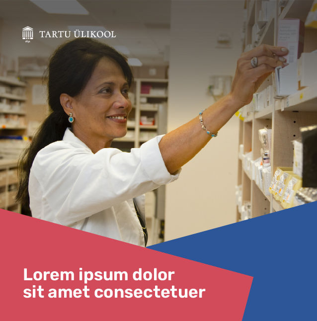
Combining the Colours of the Faculty of Medicine
The signature colour of the Faculty of Medicine is red.
You can use the blue colours of the inner circle and the colours of the faculty and topic in the middle circle.
The amount and proportion of the inner circle colours is not fixed.
Using the signature blue in the design (as a surface or font colour) is mandatory.
The colours of the inner circle and the faculties are preferred on larger surfaces and light and dark accent colours are recommended to be used in smaller amounts.
The colours can be combined with photos, graphics or a white background.
The proportion of purple and orange accent colours must be the smallest (up to 10% of the surface).

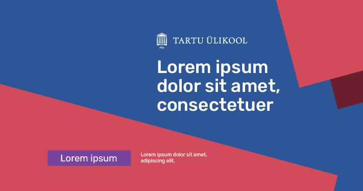
Image and link shared on Facebook 1200 × 628/630 px
Instagram image 580 × 1080 px


Leaderboard ad 728 × 90 px

Instagram Story 1080 × 1920 px
Facebook event image 1920 × 1080 px
Instagram image 580 × 1080 px
Facebook cover image 1880 × 704 px (double size)
Combining the Colours of the Faculty of Science and Technology
The signature colour of the Faculty of Science and Technology is green.
You can use the blue colours of the inner circle and the colours of the faculty and topic in the middle circle.
The amount and proportion of the inner circle colours is not fixed.
Using the signature blue in the design (as a surface or font colour) is mandatory.
The colours of the inner circle and the faculties are preferred on larger surfaces and light and dark accent colours are recommended to be used in smaller amounts.
The colours can be combined with photos, graphics or a white background.
The proportion of purple and orange accent colours must be the smallest (up to 10% of the surface).
Faculty of Science and Technology green

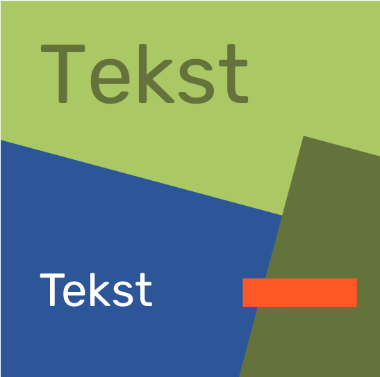
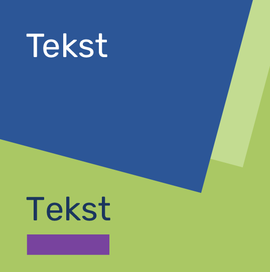
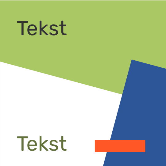
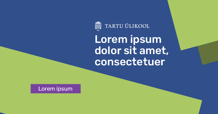
Image and link shared on Facebook 1200 × 628/630 px
Instagram image 580 × 1080 px


Leaderboard ad 728 × 90 px

Instagram Story 1080 × 1920 px
Facebook event image 1920 × 1080 px
Instagram image 580 × 1080 px
Facebook cover image 1880 × 704 px (double size)
Combining the Colours of the Entrepreneurship Topic
The signature colour of the entrepreneurship topic is turquoise.
You can use the blue colours of the inner circle and the colours of the faculty and topic in the middle circle.
The amount and proportion of the inner circle colours is not fixed.
Using the signature blue in the design (as a surface or font colour) is mandatory.
The colours of the inner circle and the topic are preferred on larger surfaces and the light and dark accent colours are recommended to be used in smaller amounts.
The colours can be combined with photos, graphics or a white background.
The proportion of purple and orange accent colours must be the smallest (up to 10% of the surface).

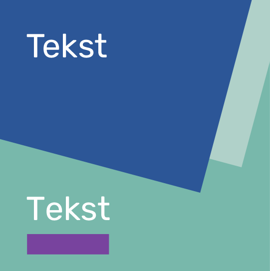
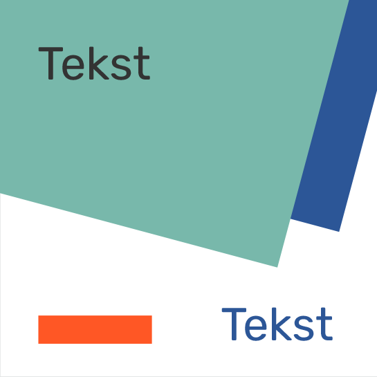
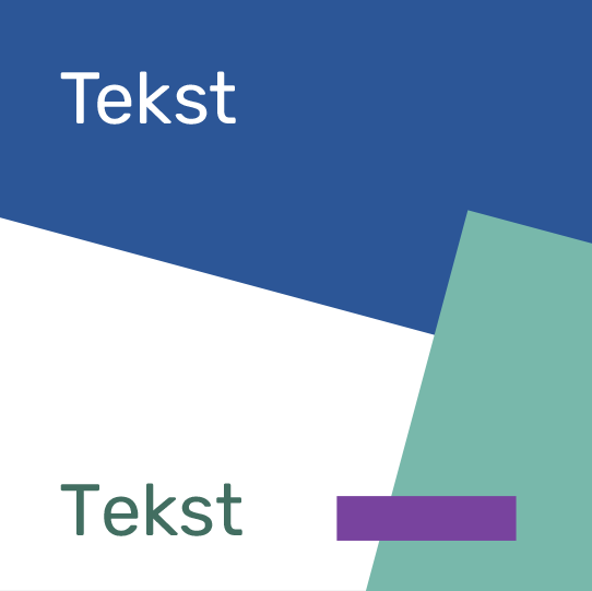
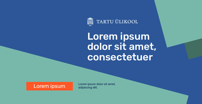
Image and link shared on Facebook 1200 × 628/630 px
Instagram image 580 × 1080 px


Leaderboard ad 728 × 90 px

Instagram Story 1080 × 1920 px
Facebook event image 1920 × 1080 px
Instagram image 580 × 1080 px
Facebook cover image 1880 × 704 px (double size)
Combining the Colours of the Culture Topic
The signature colour of the culture topic is antique pink.
You can use the blue colours of the inner circle and the colours of the faculty and topic in the middle circle.
The amount and proportion of the inner circle colours is not fixed.
Using the signature blue in the design (as a surface or font colour) is mandatory.
The colours of the inner circle and the topic are preferred on larger surfaces and the light and dark accent colours are recommended to be used in smaller amounts.
The colours can be combined with photos, graphics or a white background.
The proportion of purple and orange accent colours must be the smallest (up to 10% of the surface).

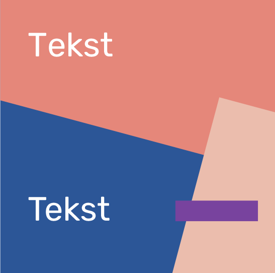
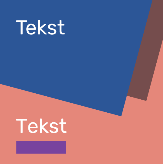
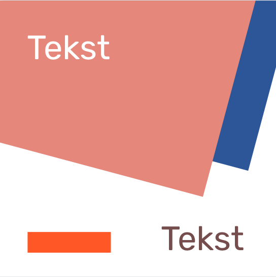
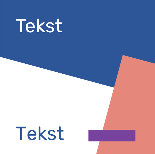
Image and link shared on Facebook 1200 × 628/630 px
Instagram image 580 × 1080 px
Leaderboard ad 728 × 90 px
Instagram Story 1080 × 1920 px
Facebook event image 1920 × 1080 px
Instagram image 580 × 1080 px
Facebook cover image 1880 × 704 px (double size)
Combining the Colours of the Student Life Topic
The signature colour of the student life topic is light blue.
You can use the blue colours of the inner circle and the colours of the faculty and topic in the middle circle.
The amount and proportion of the inner circle colours is not fixed.
Using the signature blue in the design (as a surface or font colour) is mandatory.
The colours of the inner circle and the topic are preferred on larger surfaces and the light and dark accent colours are recommended to be used in smaller amounts.
The colours can be combined with photos, graphics or a white background.
The proportion of purple and orange accent colours should be the smallest (up to 10% of the surface)

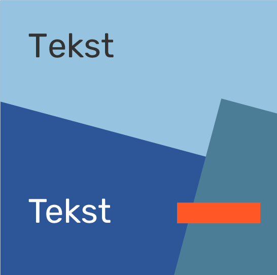
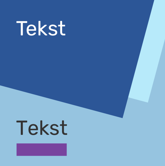
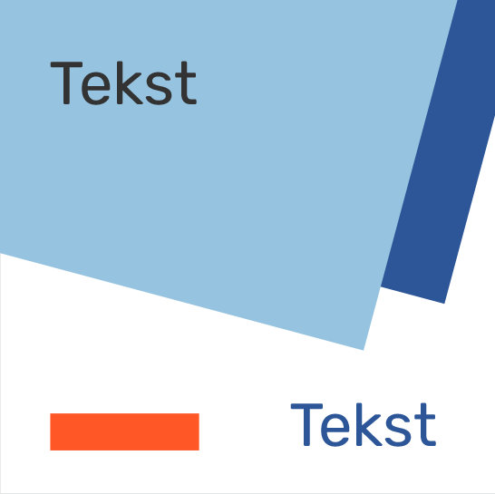
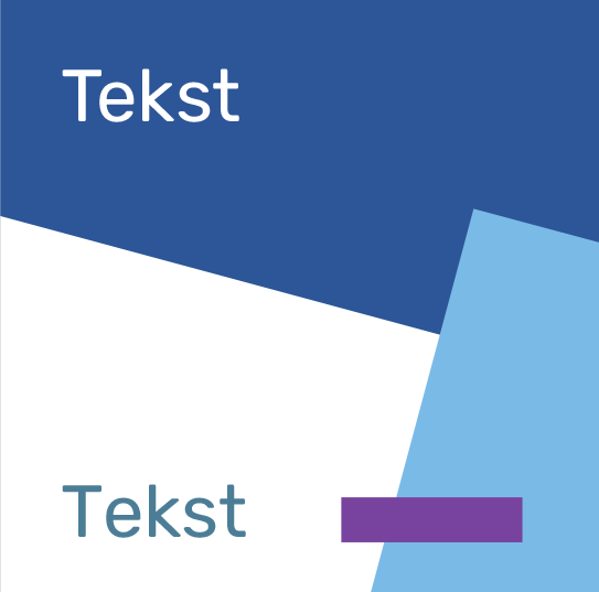
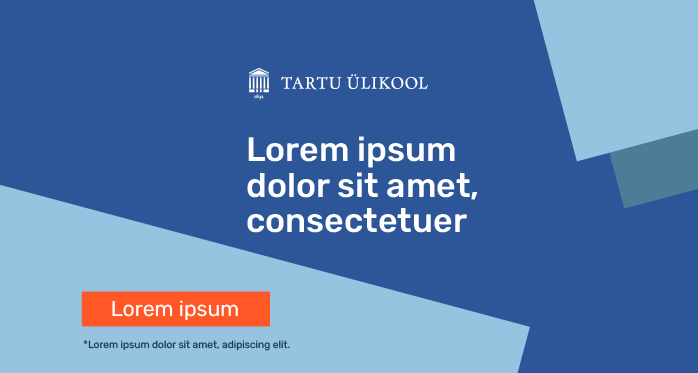
Image and link shared on Facebook 1200 × 628/630 px
Instagram image 580 × 1080 px


Leaderboard ad 728 × 90 px

Instagram Story 1080 × 1920 px
Facebook event image 1920 × 1080 px
Instagram image 580 × 1080 px

Facebook cover image 1880 × 704 px (double size)