- Home
- The Three Style Circles of UT
- Other Style Elements
- Inner Circle
- Using the Logo in the Inner Circle
- Examples of Logo Use
- Principles of Using Image Materials
- Principles of Image Placement
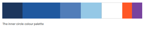
- Primary Colours
- Proportions and Combination of Colours
- Using the Style on Social Media Profile and Header Images
- Social Media Examples
- Online Advertisement Examples
- Videography Examples
- Print Material Examples
- Large Scale Surface Examples
- Merchandise Examples
- Merchandise Examples Books
- Design Examples
- Examples of Environmental Graphics
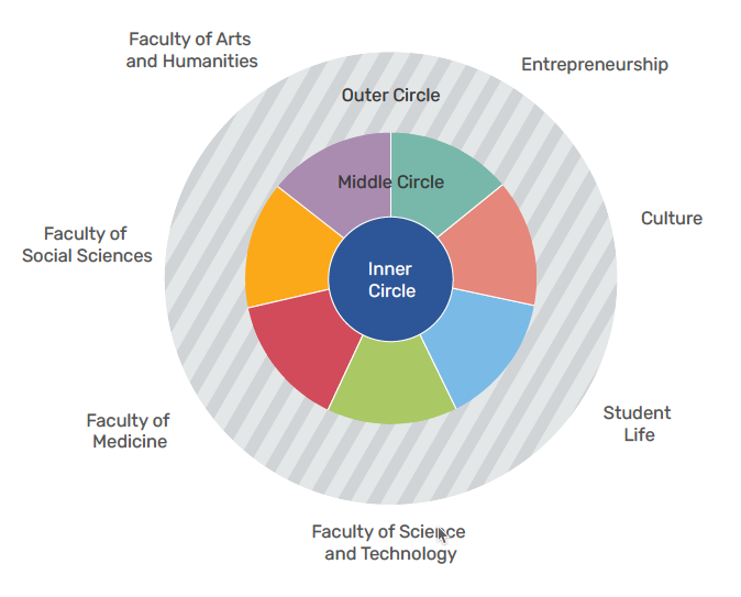
- Middle circle
- Logo Placement
- Faculty and Topic Colours
- Principles of Combining Colours
- Combining the colours of the Faculty of Arts and Humanities
- Combining the Colours of the Faculty of Social Studies
- Combining the Colours of the Faculty of Medicine
- Combining the Colours of the Faculty of Science and Technology
- Combining the Colours of the Entrepreneurship Topic
- Combining the Colours of the Culture Topic
- Combining the Colours of the Student Life Topic
- Outer Circle
- Signifying Partnership
- Special Cases and Campaigns
- Design Examples
Inner Circle
Inner Circle
The outer and middle circles are based on the inner circle.
Units can use the design principles of the inner circle without the distinctions of their faculty or institute.
The inner circle is used by:
- support units; and
- units whose main message is connected to the message of the university as a whole and is aimed at its primary target audiences.
The inner circle is used in the general image of the University of Tartu.
Using the Logo in the Inner Circle
All logo types can be used in the case of the inner circle, but the primary logo is preferred. Use of the vertical and circular logos must be reasoned.
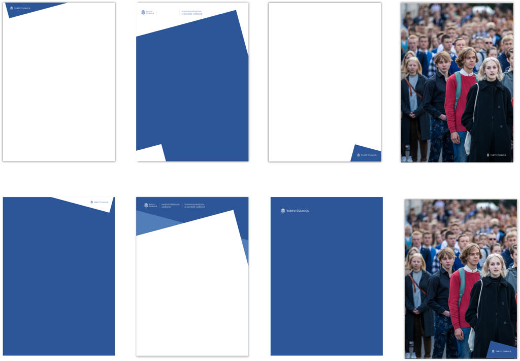
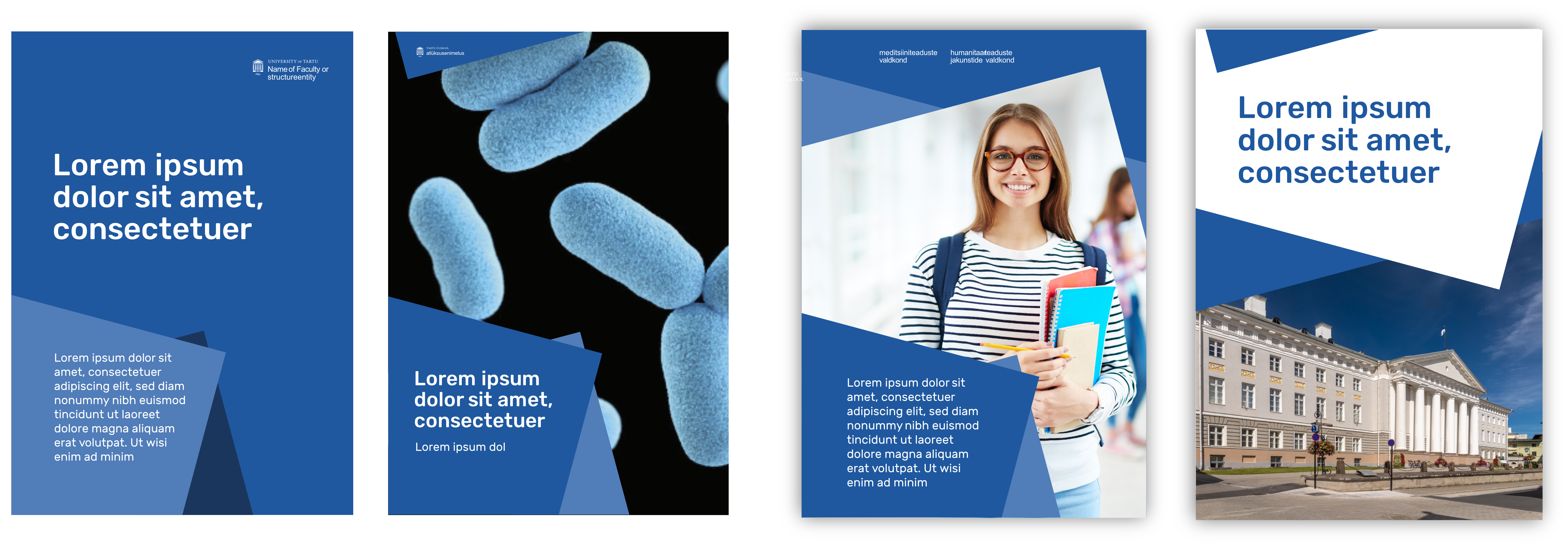
The logo can be placed in a rectangle that is at a 15 degree angle or in the negative space created by placing the rectangle(s).
The logo can also be used on a photo if there is sufficient readability. A plain and single coloured area on a photo should be preferred. Photos can be edited.
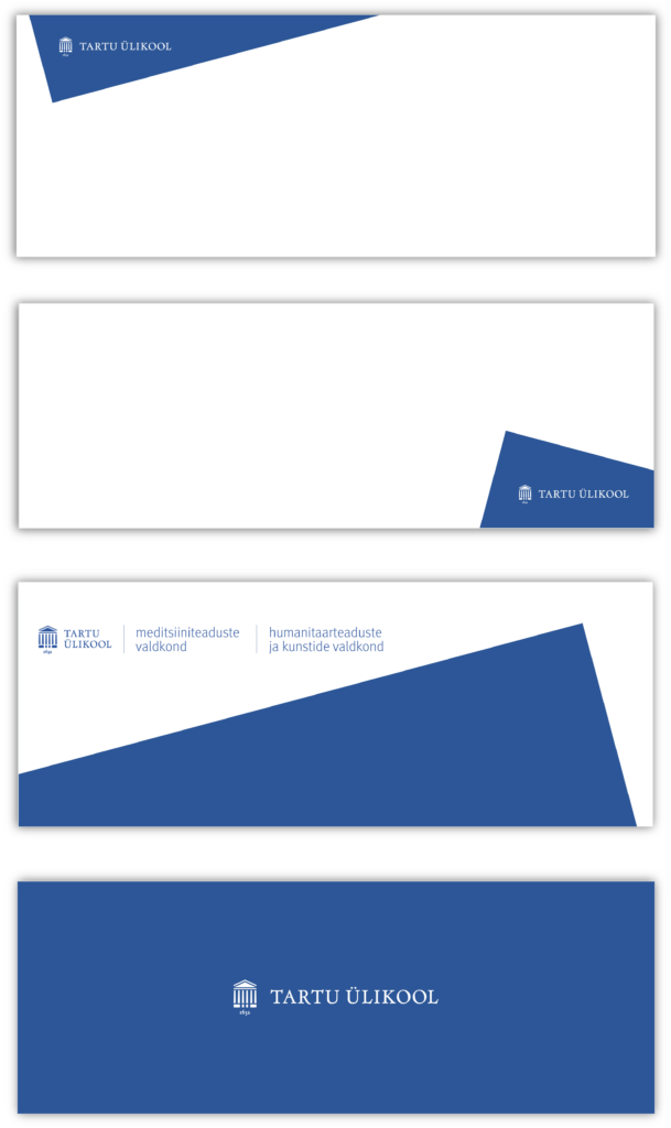
Examples of Logo Use
Principles of Using Image Materials
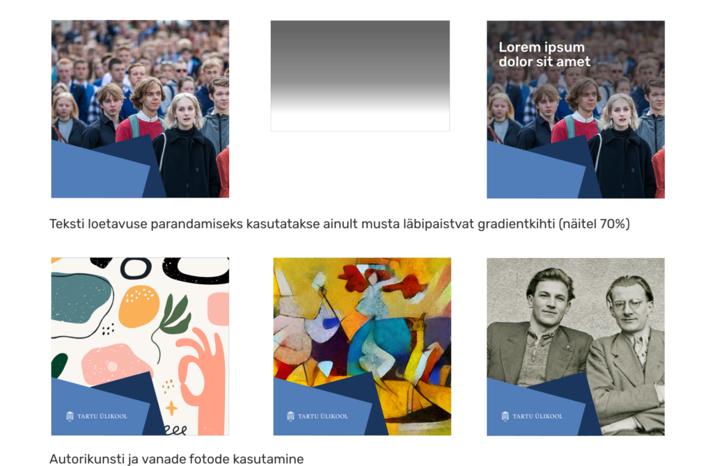
Photos, illustrations and other appropriate graphic materials are used in university materials.
The photos should have the best technical and artistic quality possible. Professional photos, natural models and well-lit settings should be preferred.
Photos can be edited in order to improve readability.
Black and white photos and old photos can be used.
In the case of original art, the image should be whole. Original art cannot be altered without the author’s consent.
Principles of Image Placement
When using photos and illustrations, you should pay attention to their technical quality; their resolution has to meet the technical terms of the final design.
Image materials can be placed on a large background as well as cut into geometric elements. When cropping an image into a rectangle that is at a 15 degree angle, the image itself must not be rotated.
If the objects on the image make it impossible to crop the image without losing important details, it must not be cropped.
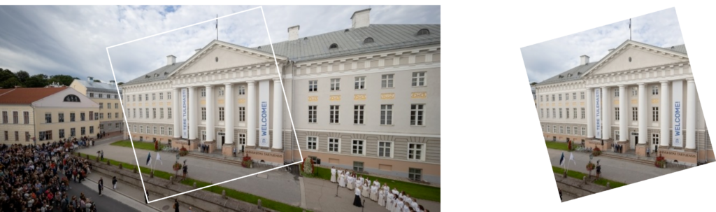
How to crop
Examples
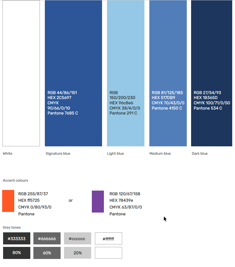
Primary Colours
The primary colours used for university materials are blues. The signature blue is used in all the style circles.
In the inner circle, you can use blue and choose one of the two accent colours for each design.
When using more than one tone of blue, the signature blue must be prevalent.
Accent colours can be used on up to 10% of the surface.
You should avoid using black for font colour. Instead, use shades of grey.
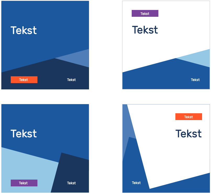
Proportions and Combination of Colours
When using more than one tone of blue, the signature blue must be prevalent.
Whether to prefer blue or white as your primary colour is up to you. The decision should be made according to the content, other design elements and placement.
On signature blue, medium blue and dark blue backgrounds, you can only use white text.
On light blue and white backgrounds you can use signature blue, dark blue and dark gray text.
The accent colour can be used on up to 10% of the surface. The accent colour cannot be used as font colour.
Using the Style on Social Media Profile and Header Images
When designing social media profile and header images, you have to consider different screen resolutions and their protected areas. See the newest instructions and tips here.
When using text over a photo, the photo should be edited if necessary to maintain readability and contrast.
Use the A11Y tool to check the background image and the font colour and size contrast compared with the background image.

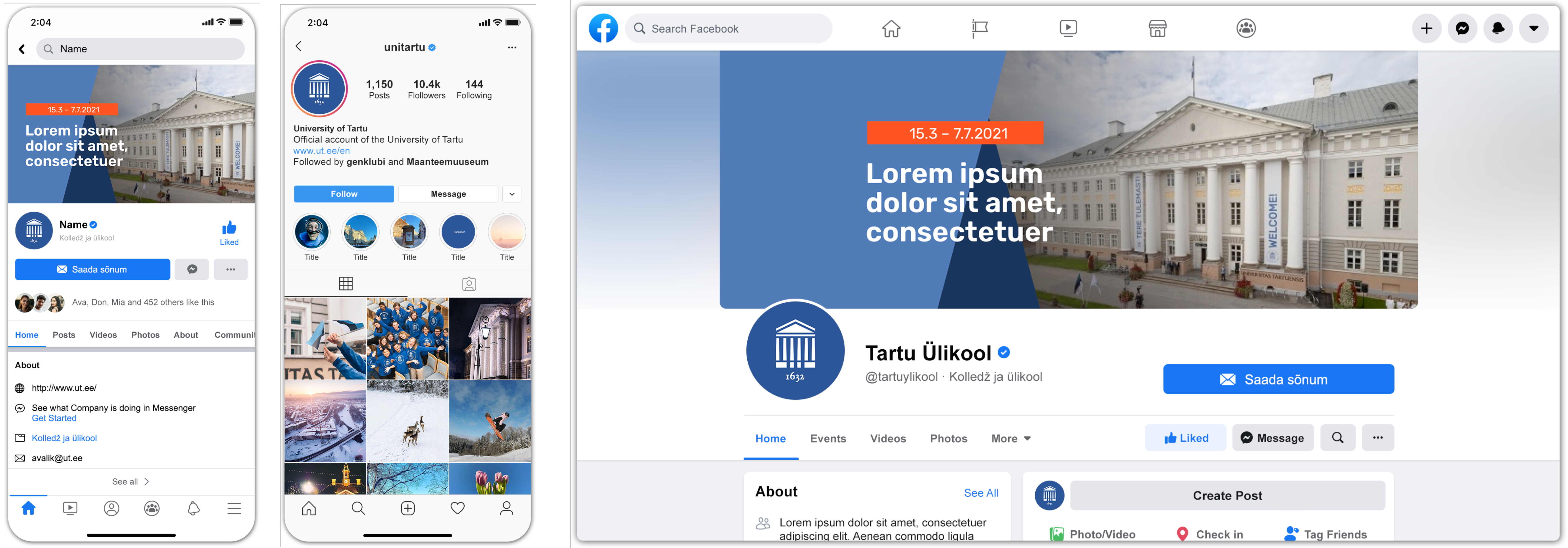
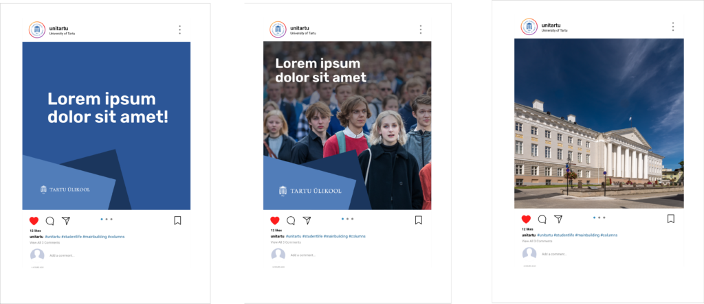
Social Media Examples
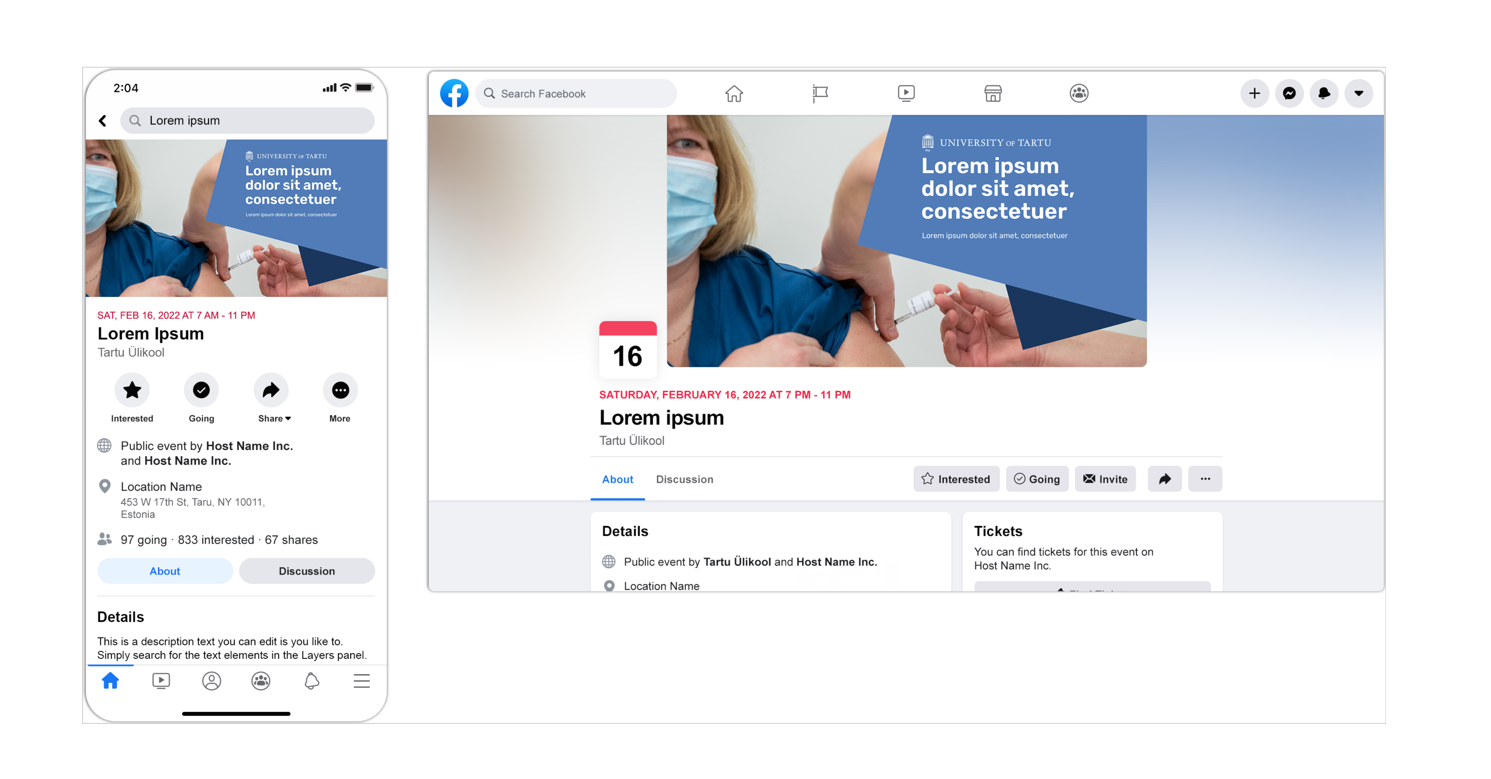
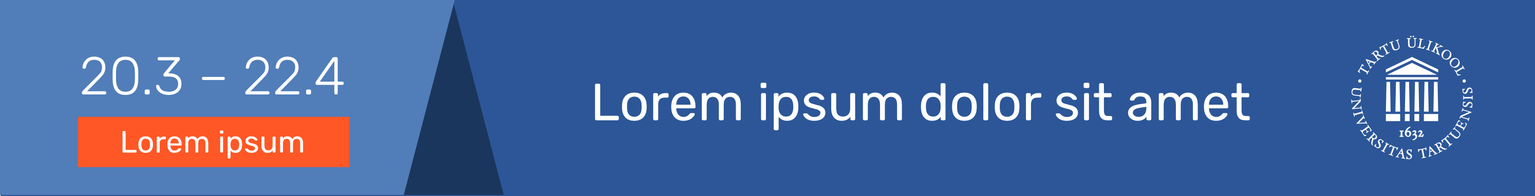
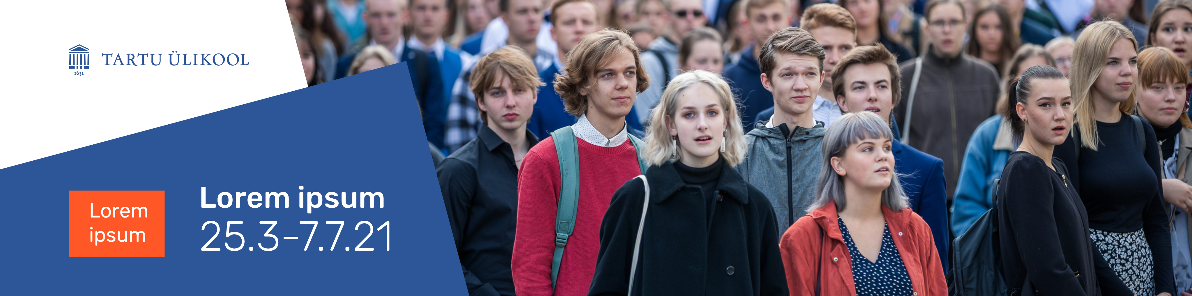
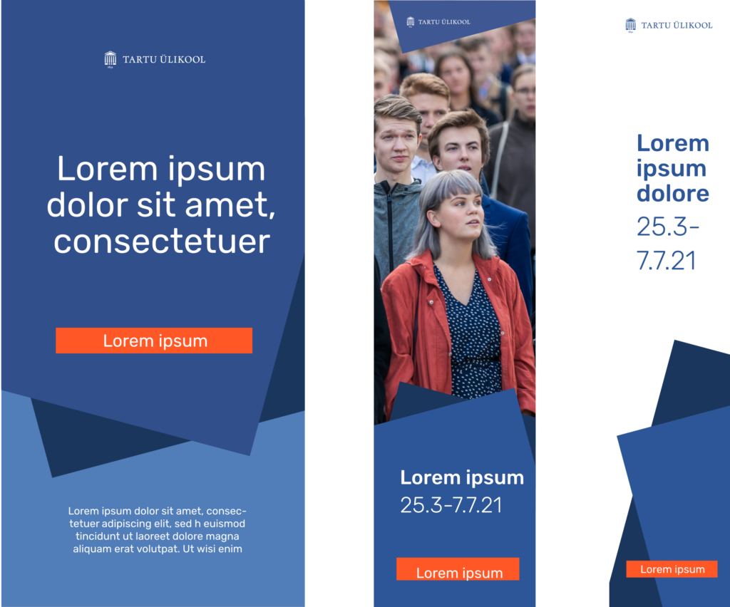
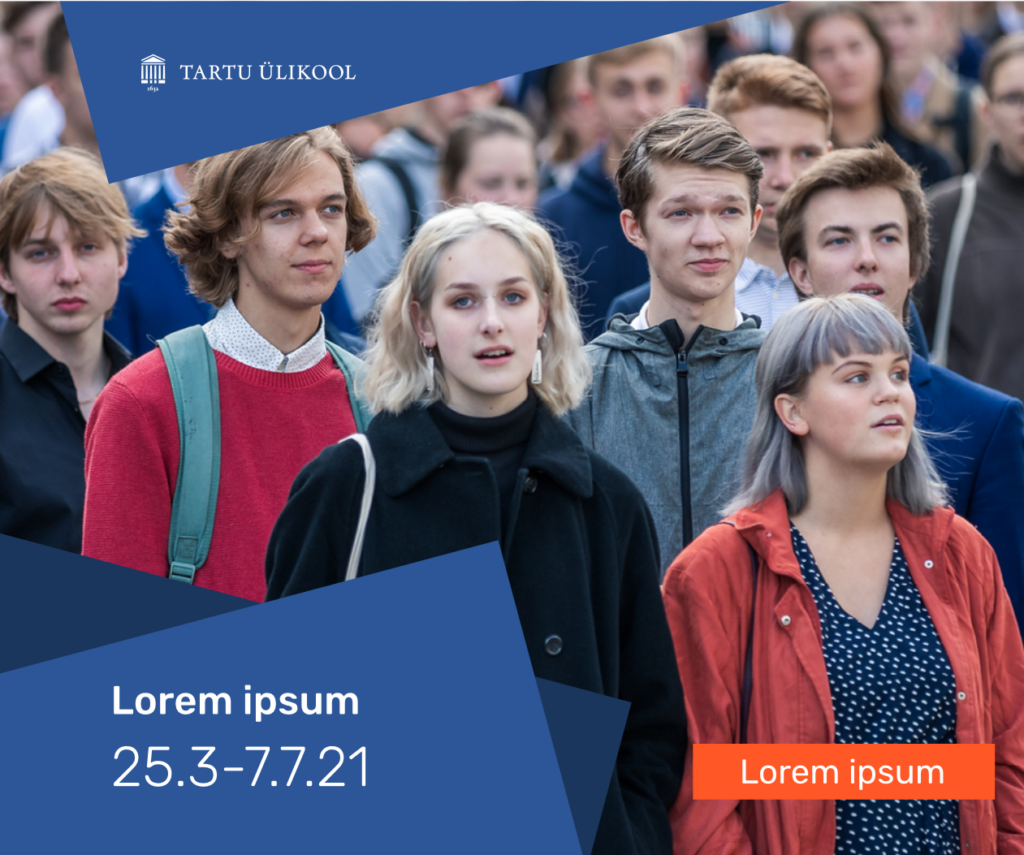
Online Advertisement Examples
When designing online advertisements, consider the following technical conditions.
You should prefer placement in which the main object on the photo and/or the text are centred on the poster or advertisement.
You can use an accent colour as a background if you want to emphasise a call to action.
Use the A11Y tool to check the background image and the font colour and size contrast compared with the background image.
Leaderboard ad 728 × 90 px
Billboard 970 × 250 px
Panel ad 300 × 250 px
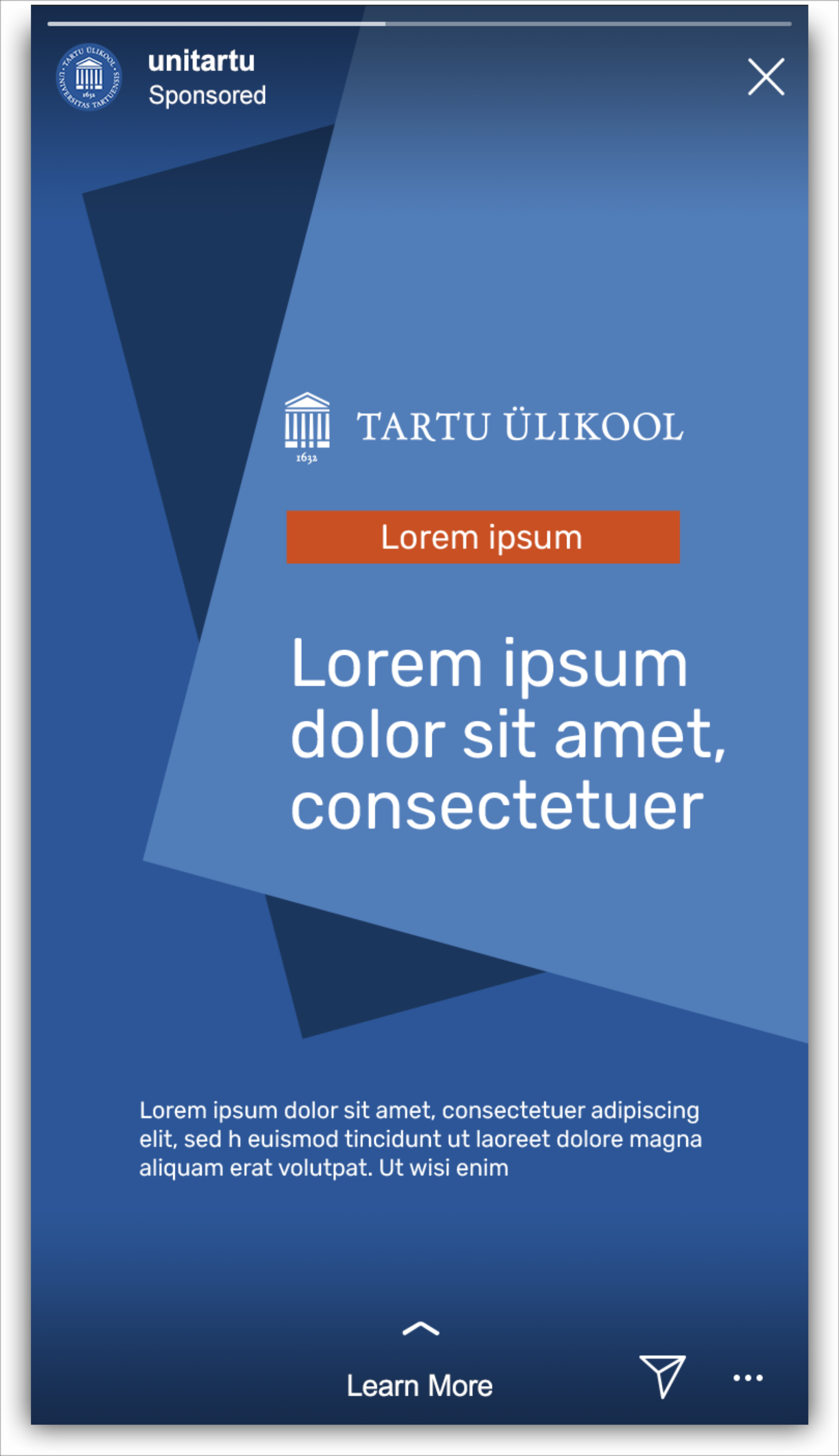
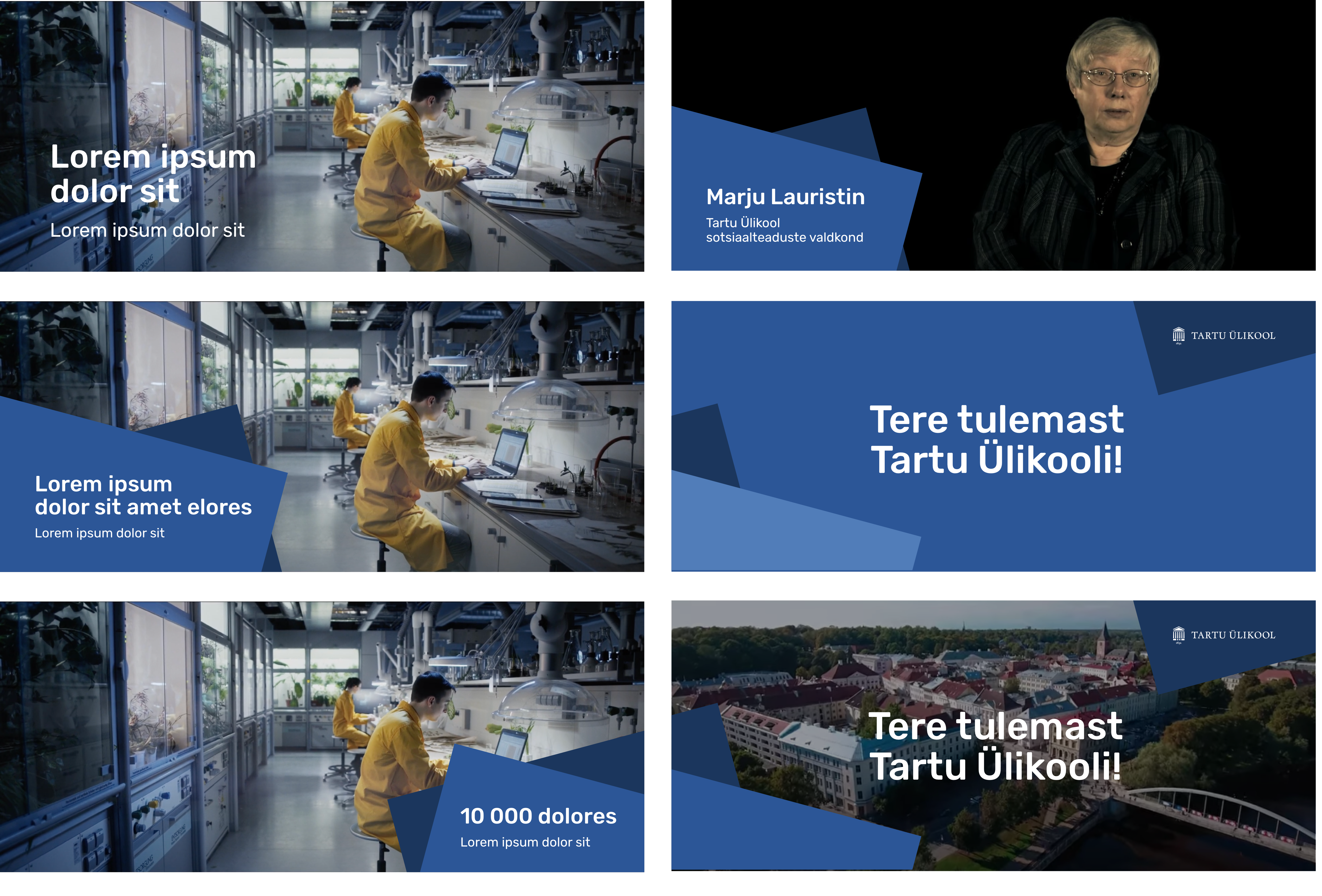
Videography Examples
When designing videography and titles, you can use geometrical elements in the colour combinations of the inner circle.
You can use the logos and text on a moving image as long as readability is maintained. A plain and single coloured area should be preferred for placement of logos or text.
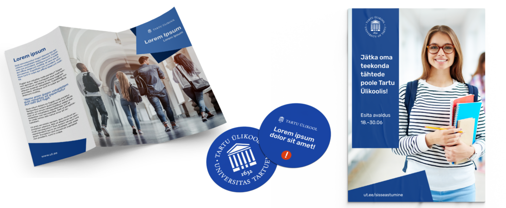
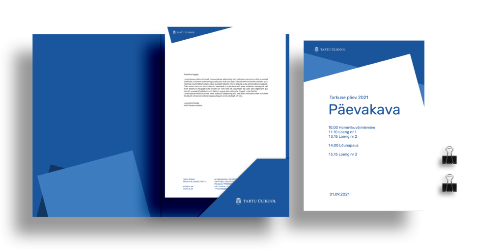
Print Material Examples
It is recommended to use Pantone colours for printing large single coloured surfaces.
You can use special print solutions in appropriate places such as embossing or foil printing.
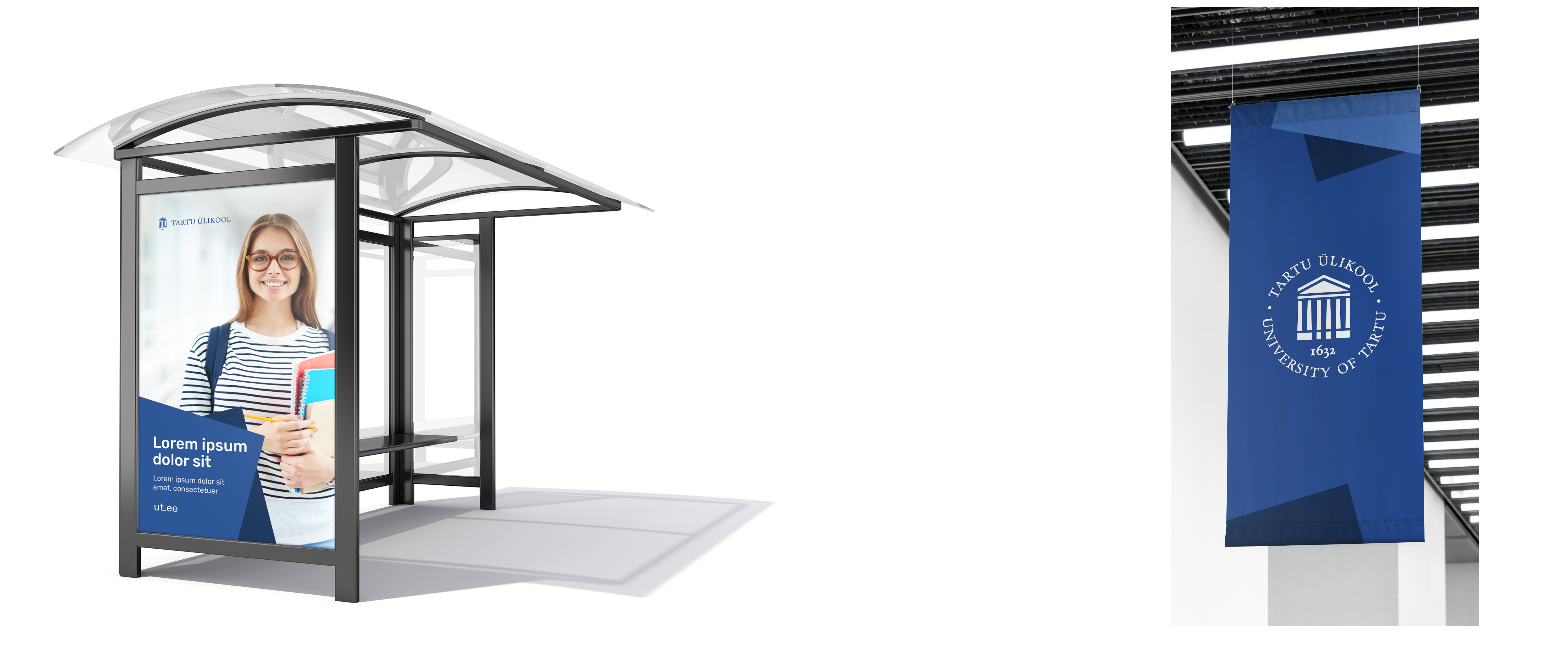
Large-Scale Surface Examples
Merchandise Examples
We recommend designing university merchandise according to the principles of the inner circle. According to the position of the unit in the university’s structure, you can use the principles of the middle or outer circle. See the chapter ‘Terms of Use of the Logo’.
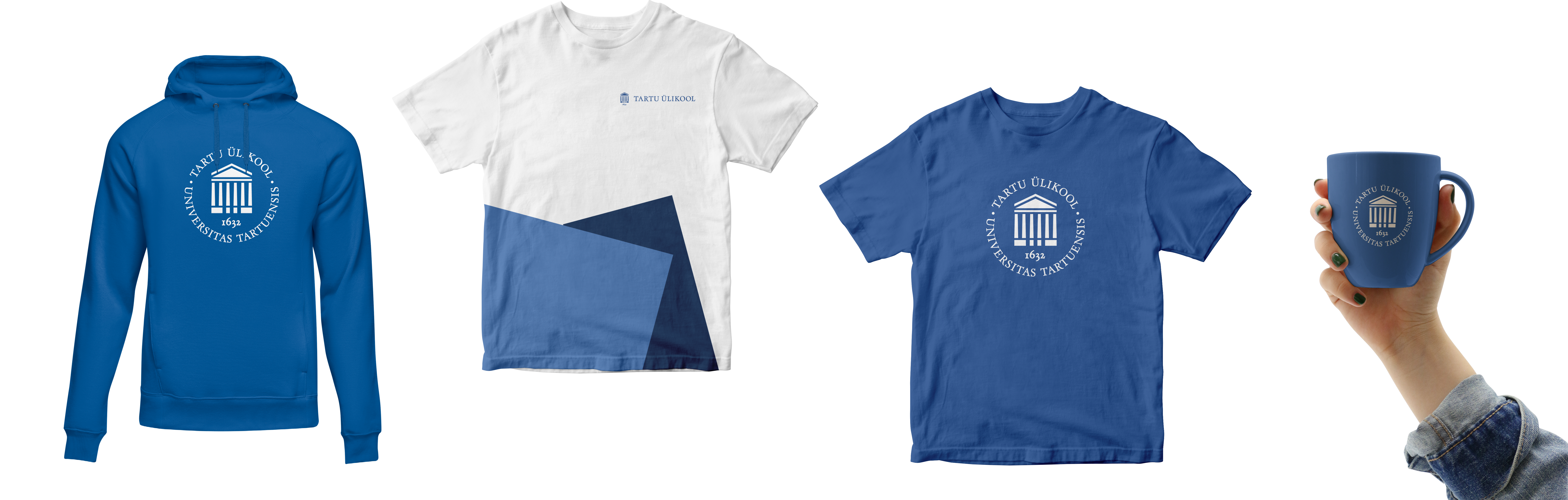
Merchandise Examples
If there is no original art commissioned for the book, it should be designed according to the university style guide.
When using pre-painted paper or other materials, you should find the closest colour to the university’s colour palette.
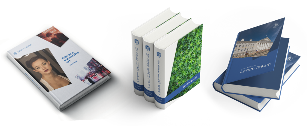
Design Examples
Examples of Environmental Graphics
The environmental graphics of the University of Tartu Museum are based on graphic elements and colour schemes that reflect the identity of the University of Tartu.
It may not be possible to replicate this example of environmental graphics in all units of the university. Among other things, possible heritage conservation requirements must be taken into account. If you would like to update the building signage, contact the cultural heritage specialist in your city.
For help and coordination, please contact the Marketing and Communication Office at cvi@ut.ee.