- Home
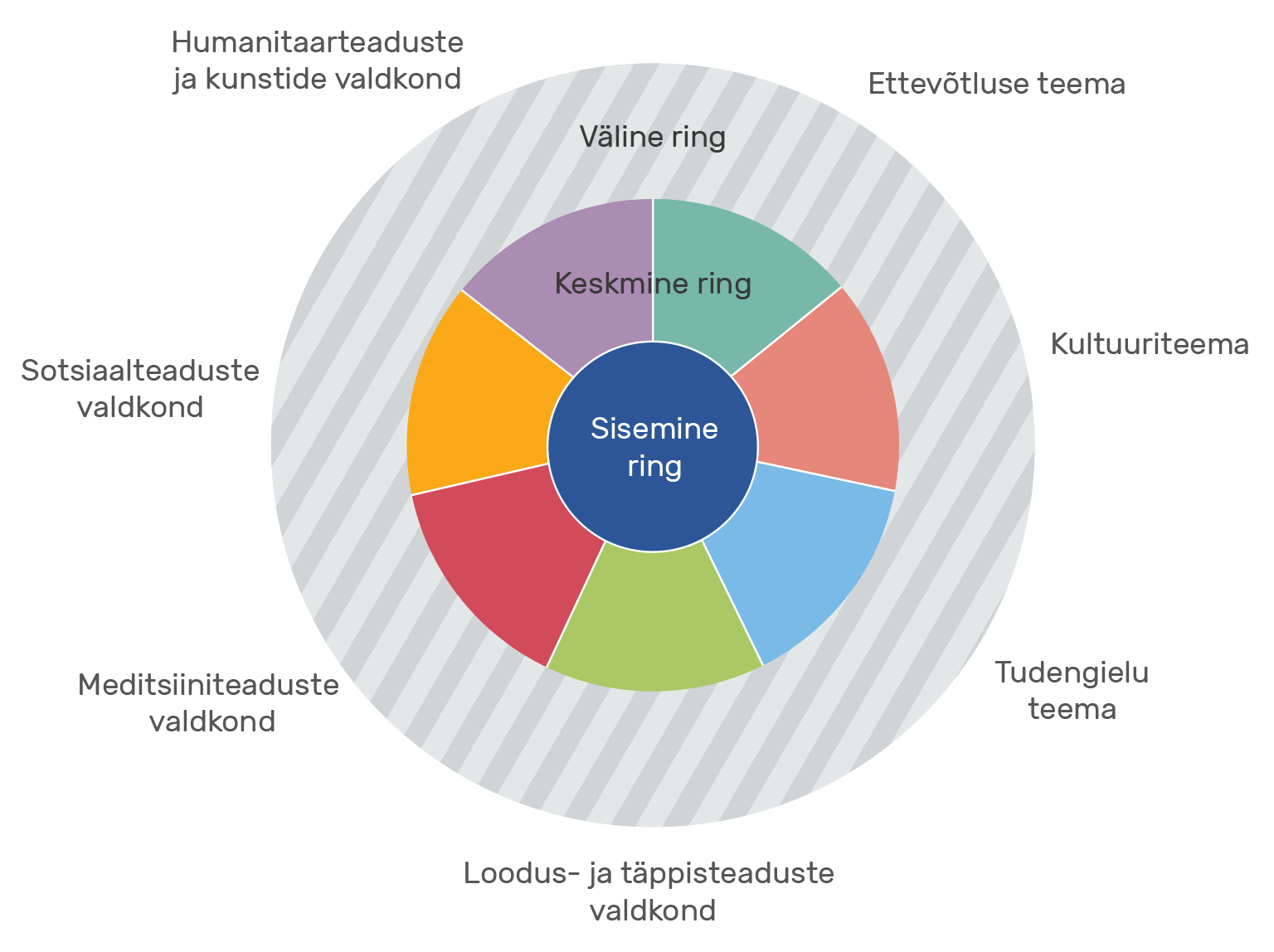
- The Three Style Circles of UT
- Other Style Elements
- Inner Circle
- Using the Logo in the Inner Circle
- Examples of Logo Use
- Principles of Using Image Materials
- Principles of Image Placement
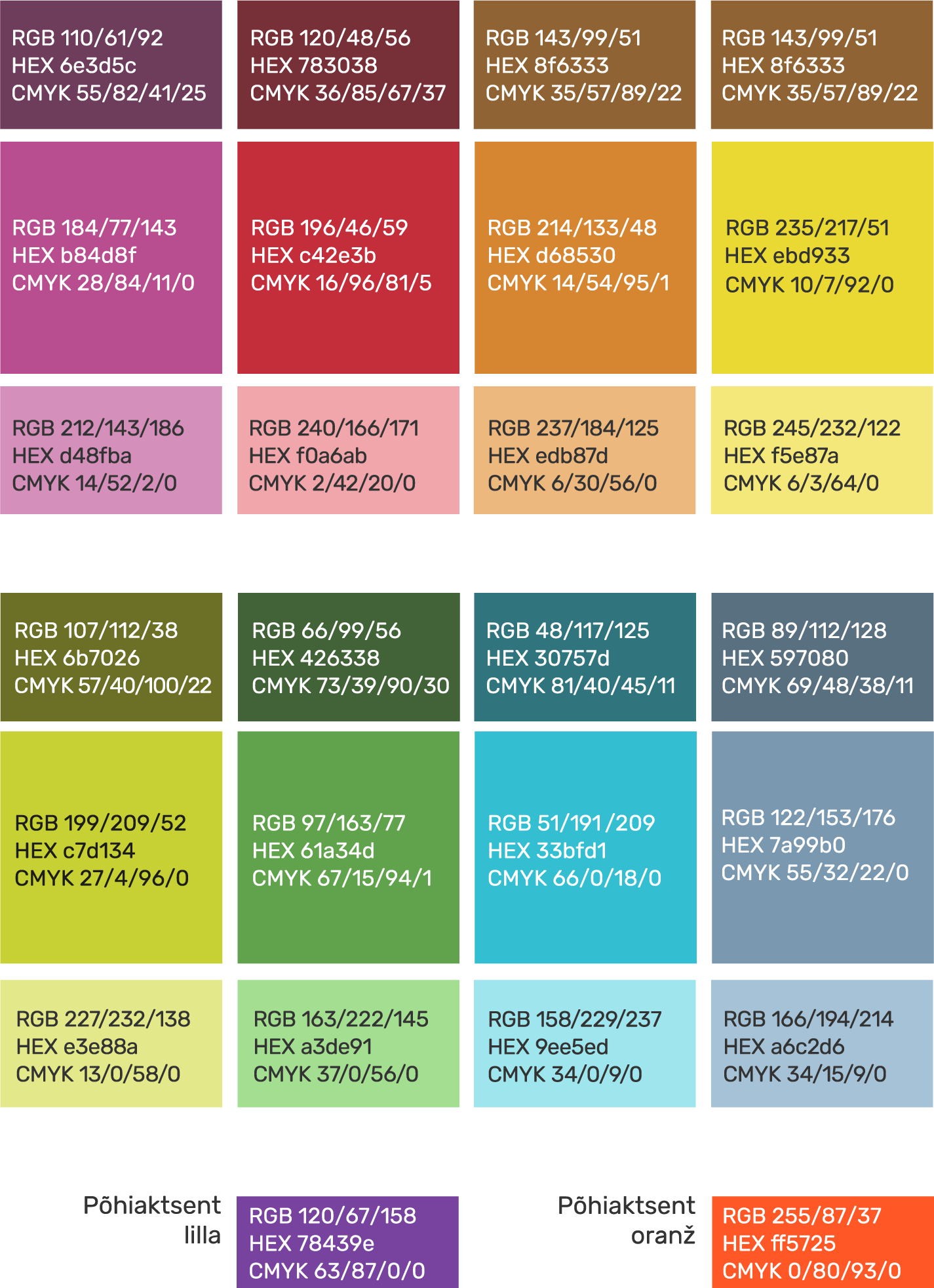
- Primary Colours
- Proportions and Combination of Colours
- Using the Style on Social Media Profile and Header Images
- Social Media Examples
- Online Advertisement Examples
- Videography Examples
- Print Material Examples
- Large Scale Surface Examples
- Merchandise Examples
- Merchandise Examples Books
- Design Examples
- Examples of Environmental Graphics
- Middle circle
- Logo Placement
- Faculty and Topic Colours
- Principles of Combining Colours
- Combining the colours of the Faculty of Arts and Humanities
- Combining the Colours of the Faculty of Social Studies
- Combining the Colours of the Faculty of Medicine
- Combining the Colours of the Faculty of Science and Technology
- Combining the Colours of the Entrepreneurship Topic
- Combining the Colours of the Culture Topic
- Combining the Colours of the Student Life Topic
- Outer Circle
- Signifying Partnership
- Special Cases and Campaigns
- Design Examples
Outer Circle
Outer Circle
The outer style circle is used primarily in communications to target groups outside of the university. This circle is meant for inclusion of a community on a topic relevant to them, for which the unit can use a different design.
The outer circle is divided into faculties and topics like the middle circle.
As there are many aims and target audiences for the outer circle, distinguishing them is reasoned. This is why there is more room for creativity and a larger selection of colour palettes and design options.
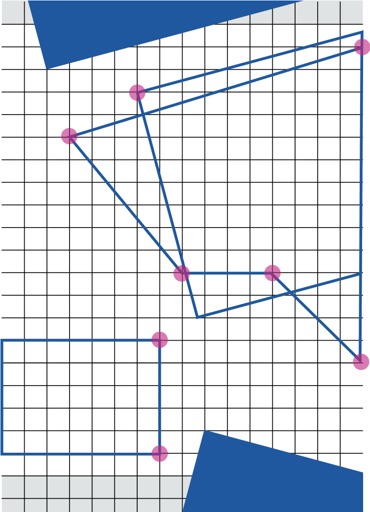
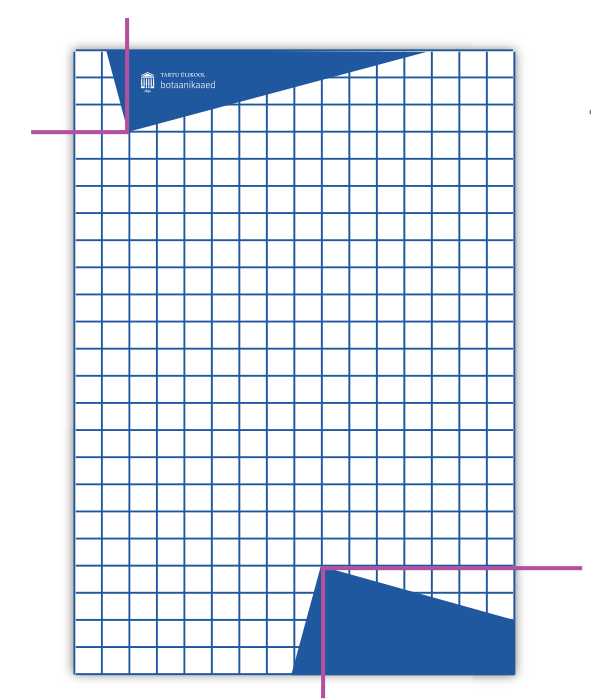
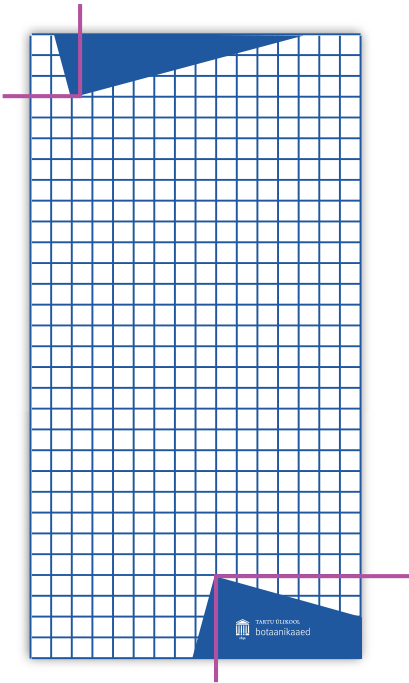
Layout of Geometric Elements in the Outer Circle
It is mandatory to use frames with signature blue elements in this style circle.
You can use other geometrical background elements in addition to the rectangles placed at 0, 15 and -15 degree angles on the content area of the designed page. Their corners must coincide with the crossing points of the base grid lines.
When placing a rectangle at a 15 or -15 degree angle, at least one of the corners must lie on the base frame grid.
Background elements must cross the edge of the designed surface.
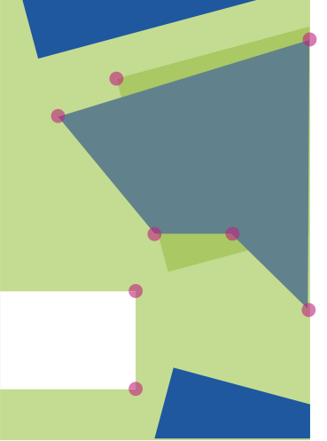
Background elements can be single coloured or filled with a photo or other image material.
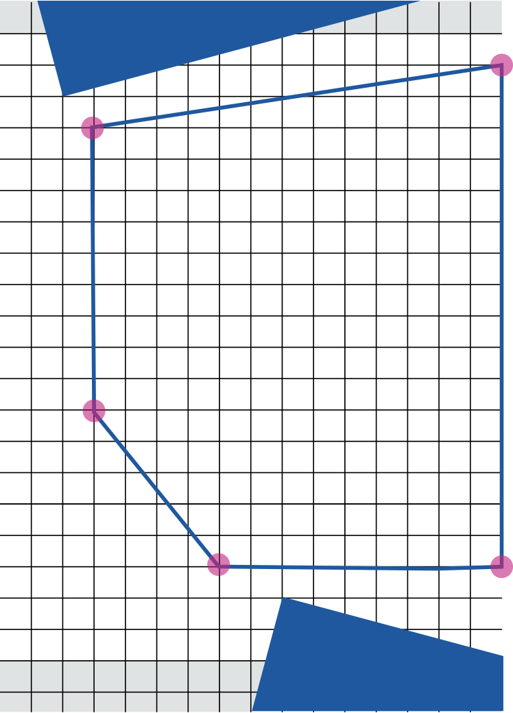


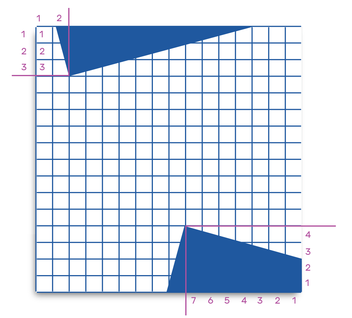
Principles of Placing a Frame
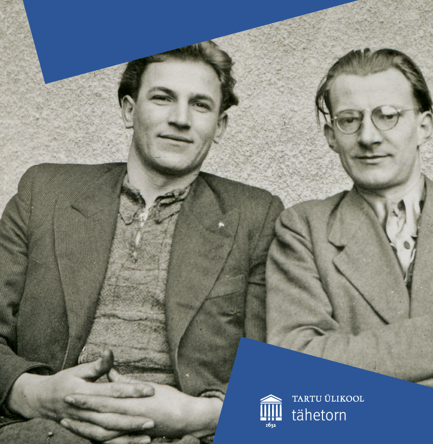
In the outer circle, it is mandatory to use a frame with signature blue elements.
The elements are two rectangles: a rectangle at a 15 degree angle in the top corner and a rectangle at a -15 degree angle in the bottom corner.
The right angle of the top rectangle is on the crossing point of the third line from the top and the second line from the left.
The right angle of the bottom rectangle is on the crossing point of the fourth line from the bottom and the seventh line from the right.
If the base frame is centre-aligned and can’t be perfectly placed according to the longer edge, the lines are counted starting with the first full square.
The frame elements are always in the signature blue colour.
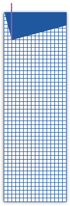
For very small formats (e.g. online advertisements with one side shorter than 120 px), a rectangle at a 15 degree angle along the entire the shorter edge is used instead of the aforementioned frame. The corner of the rectangle is two squares away from the left edge and a suitable height must be chosen by you.
Logo Placement
In the outer circle, it is mandatory to use a frame with signature blue elements.
The recommended placement for logos is on one of the elements on the right.
If the logo has to be emphasised more, it should be used on either a white or signature blue background or over a photo.
The logo can also be used on a photo if there is sufficient readability. A plain and single coloured area on a photo should be preferred. Photos can be edited.
The logo must not be placed against a background of the faculty, topic or extra palette colours. See the chapter ‘Terms of Use of the Logo’.

Colours in the Outer Circle
This style circle’s palette includes blue primary colours and one extra palette colour. You can use one extra palette colour and its light and dark tones on one surface.
The proportions of the faculty or topic colour and extra palette colour are not fixed.
Using the signature blue in the design (as a frame element) is not mandatory.
The extra palette colours must not be used as font colour. It is also recommended to not use black. Text should be in a grey tone (see page 29).
Using colours outside of the palette in design elements is not allowed.
You can also use the inner circle rules. In this case, you cannot use the extra palette colours or geometric shapes.