- Home
- The Three Style Circles of UT
- Other Style Elements
- Inner Circle
- Using the Logo in the Inner Circle
- Examples of Logo Use
- Principles of Using Image Materials
- Principles of Image Placement
- Primary Colours
- Proportions and Combination of Colours
- Using the Style on Social Media Profile and Header Images
- Social Media Examples
- Online Advertisement Examples
- Videography Examples
- Print Material Examples
- Large Scale Surface Examples
- Merchandise Examples
- Merchandise Examples Books
- Design Examples
- Examples of Environmental Graphics
- Middle circle
- Logo Placement
- Faculty and Topic Colours
- Principles of Combining Colours
- Combining the colours of the Faculty of Arts and Humanities
- Combining the Colours of the Faculty of Social Studies
- Combining the Colours of the Faculty of Medicine
- Combining the Colours of the Faculty of Science and Technology
- Combining the Colours of the Entrepreneurship Topic
- Combining the Colours of the Culture Topic
- Combining the Colours of the Student Life Topic
- Outer Circle
- Signifying Partnership
- Special Cases and Campaigns
- Design Examples
Logos
Logos
All logos available for use can be found under the University of Tartu’s public marketing materials here.
Primary Logo
The primary logo of the university is made up of a depiction of the main university building’s portico with the year 1632 written underneath and the words ‘TARTU ÜLIKOOL’ on the right. The primary logo also exists in English and Latin. You can only use the logo in one language at a time.
The primary logo is the preferred logo.
It can be used
- in the signature blue colour on a white background
- in white on backgrounds in the primary colours
- in the background of a photo
The placement of the primary logo depends on the style circle and this is explained for each of the style circles separately.


Vertical Logo
The vertical logo consists of a depiction of the main university building portico with the year 1632 written underneath and the words ‘TARTU ÜLIKOOL’ on the right in two rows. The vertical logo also exists in English and Latin. You can only use the logo in one language at a time.
The vertical logo is preferred if there is less space or if it is not possible of sensible to use the primary logo (e.g. when presented along with the logos of partners of units of the university, see page 70 for an example).
The vertical logo can be used
- in the signature blue colour on a white background
- in white on backgrounds in the primary colours
- in the background of a photo


Circular Logo
The circular logo consists of a depiction of the main university building’s portico with the year 1632 written underneath and the words ‘TARTU ÜLIKOOL’ written in a circle around it in two languages:
Estonian and English
Estonian and Latin
English and Latin
The circular logo can be used
- in the signature blue colour on a white background
- in white on backgrounds in the primary colours
- in the background of a photo
The circular logo cannot be used on the same surface with the primary or vertical logo.

Estonian and Latin circular logo

Estonian and English circular logo

English and Latin circular logo
Logo Submark
The logo submark consists of a depiction of the main university building’s portico with the year 1632 written underneath.
The logo submark is used when the primary, vertical or circular logo cannot be used or it is reasonable to use them (e.g. on the university ring, emblem, website icon).
The logo submark cannot be used next to another logo.
The year can be left off the logo submark only if it isn’t technically possible to add (e.g. on metal). This must be coordinated with the marketing and communication department.
The logo can be used submark
- in the signature blue colour on a white background
- on metal or wood
- in white on backgrounds in the primary colours
- in the background of a photo

Using Logos on Colourful Backgrounds
The primary, vertical and circular logos and the logo submark as well as the logos of the faculties and units described below can be used on backgrounds in the primary colours whether they are depicted together or separately.
If the logo is placed over a photo it should be readable and there should be enough contrast. Image editing can be used to create contrast.


Logos of Faculties and Institutes
The university faculty and institute logos consist of the university logo submark, the words ‘TARTU ÜLIKOOL’ in a smaller font size on the right and the name of the faculty or institute underneath.
The names of the faculties and institutes are written without capitalisation. Capital letters are only used according to Estonian language rules at the start of the name of a person or place (e.g. ‘Johan Skytte poliitikauuringute instituut’, ‘Narva kolledž’).
If the name is long it can be in up to three lines and words may be hyphenated. Compound words should be hyphenated at the word boundary.
All the faculty and unit logos are based on the same base grid.


Using the Logos of the University, its Faculties and Institutes Together
Sometimes you have to use the logo of the university and the name of its faculties and institutes together. In this case, the university logo is used only once rather than in front of each of the names separately.
If the placement is horizontal, the university logo submark is placed on the left and the logos of the faculties or institutes next to it in a row divided by vertical bars.
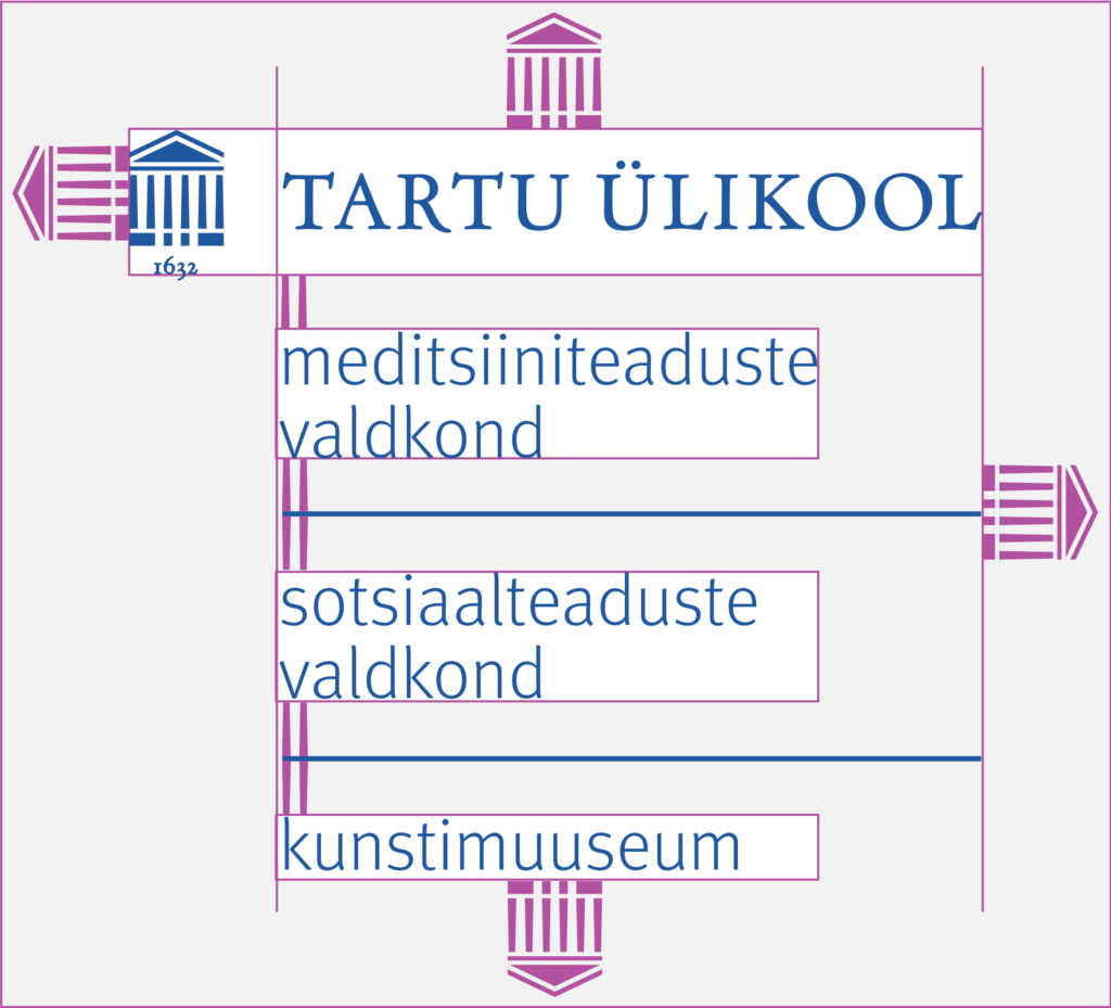
If the placement is vertical, the university primary logo is placed over the names of the units divided by horizontal lines.
The logos of units in different structural levels can be presented together (e.g. the Faculty of Arts and Humanities and the Institute of Genomics).


Protected Area of the Logo
The logo has a protected area on which no other design elements or parts can occur. When placing the logo, the size of the protected area must be considered.
The protected area of the primary logo and the logos of faculties and institutes are calculated according to the height of the portico (the space the year takes up is not counted).
The protected area of the vertical logo and circular logo are calculated according to the height of the pillars.


When the university, faculty and institute logos are used together in horizontal placement, the protected area on the edges is calculated according to the height of the portico (the space the year takes up is not counted). The space between the logos is calculated according to the total width of the two porticos next to each other.
If the university, faculty and institute logos are used together in vertical placement, the protected area on the edges is calculated according to the height of the portico (the space the year takes up is not counted). The space between the university and faculty logos is the height of the pillars and between other logos twice the height of the pillars.


Terms of Use of the Logo
The logo cannot:
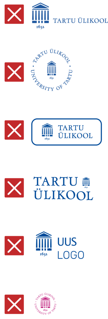
- be stretched in any direction and the proportions of its elements cannot be changed;
- have additional or altered text.
Any additional text must be set apart from the logo and cannot form an independent whole with the logo.
Logo elements must not be:
- moved or added;
- used for creating new (partnership) logos.
Use of logos for signifying partnerships is described on page 70.
Only the signature blue and white can be used in university logos, except when:
- only black and white can be used; or
- the logo is carved or engraved (e.g. on metal or wood).
The allowed colour combinations are the signature blue on a white background or white on backgrounds in the primary colours.


